Load packages
# numerical calculation & data frames import numpy as npimport pandas as pd# visualization import matplotlib.pyplot as pltimport seaborn as snsimport seaborn.objects as so# statistics import statsmodels.api as sm# pandas options 'mode.copy_on_write' , True ) # pandas 2.0 = ' {:.2f} ' .format # pd.reset_option('display.float_format') = 7 # max number of rows to display # NumPy options = 2 , suppress= True ) # suppress scientific notation # For high resolution display import matplotlib_inline"retina" )
Python implementation
앞서 다룬 선형 모형, linear (regression) model은 일반적인 \(\hat{y} = \beta_0 + \beta_1 x_1 + \beta_2 x_2 + ~... ~ + \beta_n x_n\) 형태를 띄고,
앞의 예는 \(n=1\) 에 해당하며, \(\hat{y} =\beta_0 +\beta_1x_1\) 에 대해서Wilkinson-Rodgers notation 이라고 부르는 symbolic notation을 사용하여 표현하고, 통계에서 주로 사용됨.
Formula y ~ x는 \(\hat{y} =\beta_0 +\beta_1x\) 으로 해석되어 처리됨.
모형과 데이터의 거리인 RMSE가 최소가 되도록 하는 ordinary least square (OLS) estimate인 \(\beta_0, \beta_1\) 을 구하면, best model을 구할 수 있고,
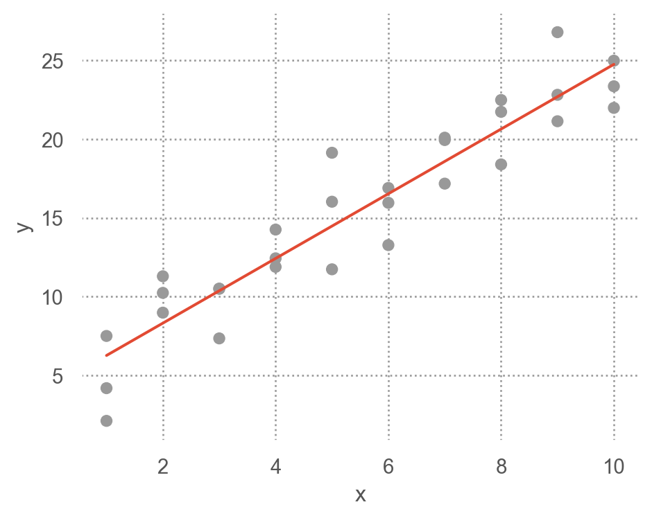
그 fitted line은 \(\hat{y} = 4.22 + 2.05x\)
from statsmodels.formula.api import ols= ols("y ~ x" , data = sim1)# 모델의 parameter 즉, coefficients를 내줌 # Intercept 4.22 # x 2.05 # 위에서 구한 파라미터값과 동일함 (참고) Linear models의 경우 위에서 처럼 optimization을 이용하지 않고 방정식의 해를 구하듯 closed form으로 최소값을 구함
\(n=2\) 인 경우, 즉 두 변수 x1, x2로 y를 예측하는 경우,
Formula y ~ x1 + x2는 모형 \(\hat{y} = \beta_0 +\beta_1x_1 + \beta_2x_2\) 을 의미
"y ~ x1 + x2" , data = df)
= sm.datasets.get_rdataset("SaratogaHouses" , "mosaicData" ).data3 )
    price  lotSize  age  landValue  livingArea  pctCollege  bedrooms  \
0  132500     0.09   42      50000         906          35         2
1  181115     0.92    0      22300        1953          51         3
2  109000     0.19  133       7300        1944          51         4

   fireplaces  bathrooms  rooms          heating      fuel              sewer  \
0           1       1.00      5         electric  electric             septic
1           0       2.50      6  hot water/steam       gas             septic
2           1       1.00      8  hot water/steam       gas  public/commercial

  waterfront newConstruction centralAir
0         No              No         No
1         No              No         No
2         No              No         No
from statsmodels.formula.api import ols= ols("price ~ livingArea + bedrooms" , data= houses).fit()= True )
OLS Regression Results
Dep. Variable:
price
R-squared:
0.515
Model:
OLS
Adj. R-squared:
0.515
No. Observations:
1728
F-statistic:
917.4
Covariance Type:
nonrobust
Prob (F-statistic):
4.31e-272
coef
std err
t
P>|t|
[0.025
0.975]
Intercept
3.667e+04
6610.293
5.547
0.000
2.37e+04
4.96e+04
livingArea
125.4050
3.527
35.555
0.000
118.487
132.323
bedrooms
-1.42e+04
2675.159
-5.307
0.000
-1.94e+04
-8949.872
Notes:
[1] Standard Errors assume that the covariance matrix of the errors is correctly specified.
[2] The condition number is large, 7.75e+03. This might indicate that there are
strong multicollinearity or other numerical problems.
\(\widehat{price} = 36668.9 + 125.4 \cdot livingArea - 14196.8 \cdot bedrooms\) 계수들의 의미 를 파악하는 것이 통계에서 매우 중요한 주제임.
위와 같이 2개의 예측변수로 평면꼴의 선형모형을 세운다면, 다음과 같은 fitted plane을 구할 수 있음.
# patsy from patsy import dmatrices # design matrix = "price ~ livingArea + bedrooms" = dmatrices(formula, data= houses, return_type= "dataframe" )
         price
0    132500.00
1    181115.00
2    109000.00
...        ...
1725 194900.00
1726 125000.00
1727 111300.00

[1728 rows x 1 columns]
      Intercept  livingArea  bedrooms
0          1.00      906.00      2.00
1          1.00     1953.00      3.00
2          1.00     1944.00      4.00
...         ...         ...       ...
1725       1.00     1099.00      2.00
1726       1.00     1225.00      3.00
1727       1.00     1959.00      3.00

[1728 rows x 3 columns]
# 머신 러닝에서는 보통 직접 입력 = houses["price" ], houses[["livingArea" , "bedrooms" ]]
0       132500
1       181115
2       109000
         ...
1725    194900
1726    125000
1727    111300
Name: price, Length: 1728, dtype: int64
      livingArea  bedrooms
0            906         2
1           1953         3
2           1944         4
...          ...       ...
1725        1099         2
1726        1225         3
1727        1959         3

[1728 rows x 2 columns]
Visualising models
Fitted models을 이해하기 위해 모델이 예측하는 부분(prediction) 과 모델이 놓친 부분(residuals) 을 시각화해서 보는 것이 유용함
Predictions: the pattern that the model has captured
우선, 예측 변수들의 데이터 값을 커버하는 grid를 구성
= pd.read_csv("data/sim1.csv" )
     x     y
0    1  4.20
1    1  7.51
2    1  2.13
..  ..   ...
27  10 24.97
28  10 23.35
29  10 21.98

[30 rows x 2 columns]
# create a grid for the range of x sim1: new data = pd.DataFrame(dict (x= np.linspace(sim1.x.min (), sim1.x.max (), 10 )))
모델에 grid를 입력하여 prediction값을 추가
# a model for sim1 from statsmodels.formula.api import ols= ols("y ~ x" , data= sim1).fit()"pred" ] = sim1_mod.predict(grid) # column 이름이 매치되어야 함
       x  pred
0   1.00  6.27
1   2.00  8.32
2   3.00 10.38
..   ...   ...
7   8.00 20.63
8   9.00 22.68
9  10.00 24.74

[10 rows x 2 columns]
prediction을 시각화
Show the code
= 'x' , y= 'y' )= ".8" ))= "." , pointsize= 10 ), x= grid.x, y= grid.pred) # prediction! = (4.5 , 3.5 ))
Residuals: what the model has missed.
\(e = Y - \hat{Y}\) : 관측값 - 예측값
"resid" ] = sim1_mod.resid # Y - Y_hat
     x     y  fitted  resid
0    1  4.20    6.27  -2.07
1    1  7.51    6.27   1.24
2    1  2.13    6.27  -4.15
..  ..   ...     ...    ...
27  10 24.97   24.74   0.23
28  10 23.35   24.74  -1.39
29  10 21.98   24.74  -2.76

[30 rows x 4 columns]
우선, residuals의 분포를 시각화해서 살펴보면,
= "whitegrid" )"resid" ].hist(bins= 20 );
예측 변수와 residuals의 관계를 시각화해서 보면,
= 'x' , y= 'resid' )5 ))= (5 , 4 ))
위의 residuals은 특별한 패턴을 보이지 않아야 모델이 데이터의 패턴을 잘 잡아낸 것으로 판단할 수 있음.
Residuals에 패턴이 보이는 경우
Categorical variables
predictor가 카테고리 변수인 경우 이를 numeric으로 바꾸어야 함
formula y ~ sex의 경우, \(y=a_0 +a_1sex\) 로 변환될 수 없음 (성별을 연산할 수 없음)
실제로, formula는 \(sex[T.male]\) 라는 indicator/dummy variable을 새로 만들어 membership을 나타내 줌: dummy-coding 또는 one-hot encoding 이라고 부름.
\(y=a_0 +a_1sex[T.male]\) (남성일 때, \(sex[T.male]=1\) , 그렇지 않은 경우 0)
Machine learning 알리고즘 중에 non-parametric 모델은 카테고리 변수를 직접 처리할 수 있음
Patsy의 formula는 편리하게 범주형 변수를 알아서 처리해 주기 때문에 범주형 변수의 복잡한 처리과정을 걱정할 필요가 없음.
직접 변환하려면 pandas의 pd.get_dummies()나 scikit-learn의 OneHotEncoder를 이용
2개의 범주인 경우: 한 개의 변수 sex[T.male]이 생성
= pd.DataFrame({"sex" : ["male" , "female" , "male" ], "response" : [10 , 21 , 13 ]})
      sex  response
0    male        10
1  female        21
2    male        13
# Design matrix from patsy import dmatrices= dmatrices('response ~ sex' , data= df, return_type= "dataframe" )
   Intercept  sex[T.male]
0       1.00         1.00
1       1.00         0.00
2       1.00         1.00
세 개의 범주인 경우: 두 개의 변수 sex[T.male], sex[T.neutral]가 생성
일반적으로 n개의 범주를 가진 변수인 경우 n-1개의 변수가 생성
= pd.DataFrame({"sex" : ["male" , "female" , "male" , "neutral" ], "response" : [10 , 21 , 13 , 5 ]})
       sex  response
0     male        10
1   female        21
2     male        13
3  neutral         5
= dmatrices("response ~ sex" , data= df, return_type= "dataframe" )
   Intercept  sex[T.male]  sex[T.neutral]
0       1.00         1.00            0.00
1       1.00         0.00            0.00
2       1.00         1.00            0.00
3       1.00         0.00            1.00
직접 변환: pandas의 get_dummies를 이용
"sex" ], prefix= "sex" ) # drop_first=True
   sex_female  sex_male  sex_neutral
0       False      True        False
1        True     False        False
2       False      True        False
3       False     False         True
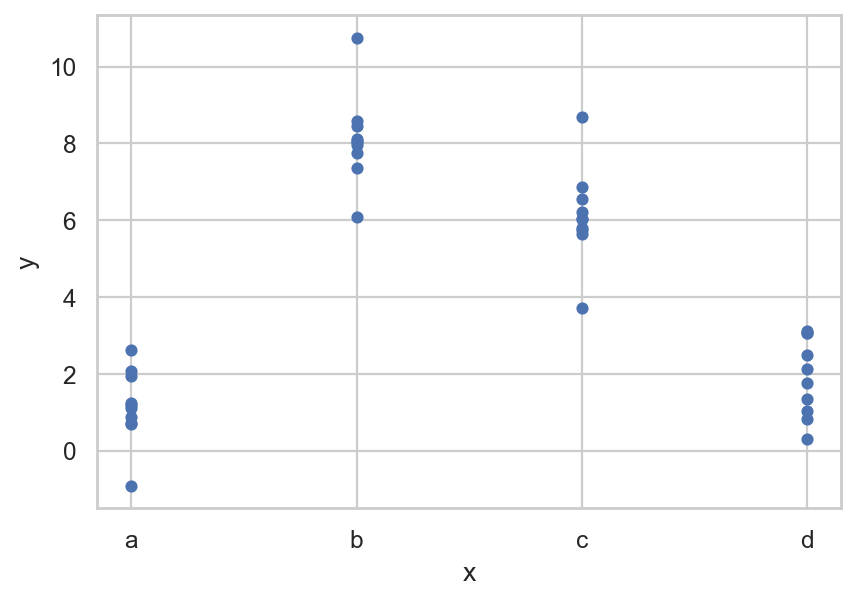
실제 예를 들어서 살펴보면,sim2.csv
= pd.read_csv("data/sim2.csv" )
    x    y
0   a 1.94
1   a 1.18
2   a 1.24
.. ..  ...
37  d 2.13
38  d 2.49
39  d 0.30

[40 rows x 2 columns]
= "x" , y= "y" );
Fit a model to Data
= ols('y ~ x' , data= sim2).fit()
Intercept   1.15
x[T.b]      6.96
x[T.c]      4.98
x[T.d]      0.76
dtype: float64
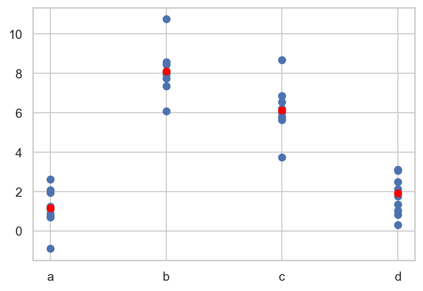
모델을 이용해 새로운 데이터의 예측값을 구하면
= pd.DataFrame({"x" : list ("abcd" )}) # new data "pred" ] = mod2.predict(grid)
   x  pred
0  a  1.15
1  b  8.12
2  c  6.13
3  d  1.91
예측값을 시각화하면,
# plt.scatter scatter plot, 점의 내부가 채워지지 않도록 설정 "x" ], sim2["y" ])"x" ], grid["pred" ], color= "red" )
fitted model의 파라미터를 보면,y ~ x는 실제 \(\hat{y} = a_0 + a_1x[T.b] + a_2 x[T.c] + a_3 x[T.d]\) 으로 해석
= dmatrices("y ~ x" , data= sim2, return_type= "dataframe" )"x" ]], axis= 1 ).sample(8 )
    Intercept  x[T.b]  x[T.c]  x[T.d]  x
7        1.00    0.00    0.00    0.00  a
18       1.00    1.00    0.00    0.00  b
15       1.00    1.00    0.00    0.00  b
..        ...     ...     ...     ... ..
8        1.00    0.00    0.00    0.00  a
9        1.00    0.00    0.00    0.00  a
5        1.00    0.00    0.00    0.00  a

[8 rows x 5 columns]
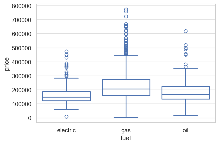
SaratogaHouses 데이터셋에 적용해 보면,
= sm.datasets.get_rdataset("SaratogaHouses" , "mosaicData" ).data= "price" , x= "fuel" , data= houses, fill= False );
= ols("price ~ fuel" , data= houses)
Intercept     164937.57
fuel[T.gas]    63597.52
fuel[T.oil]    23796.83
dtype: float64
\(\widehat{price}\) = $164,937 + $635,979· fuel[T.gas] + $23,796·fuel[T.oil]
절편 $164,937: dummy variables의 값이 모두 0일 때, 즉 electric일 때의 평균 가격
fuel[T.gas] = 0, fuel[T.oil] = 0, fuel[T.electric] = 1 일 때각 기울기는 electric일과 해당 fuel 종류의 평균 가격의 차이를 의미
= dmatrices("price ~ fuel" , data= houses, return_type= "dataframe" )
      Intercept  fuel[T.gas]  fuel[T.oil]
0          1.00         0.00         0.00
1          1.00         1.00         0.00
2          1.00         1.00         0.00
...         ...          ...          ...
1725       1.00         1.00         0.00
1726       1.00         1.00         0.00
1727       1.00         1.00         0.00

[1728 rows x 3 columns]
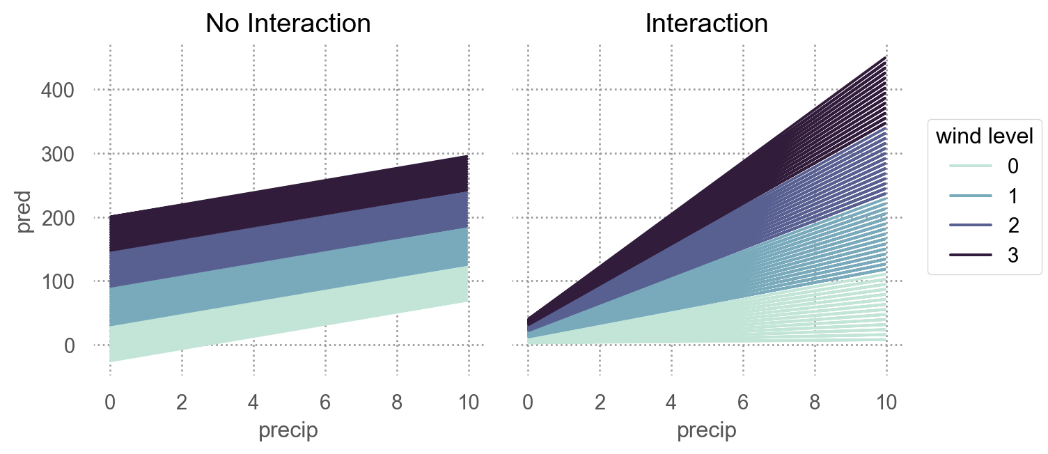
Interactions
Two continuous
두 연속변수가 서로 상호작용하는 경우: not additive, but multiplicative
각각의 효과가 더해지는 것을 넘어서서 서로의 효과를 증폭시키거나 감소시키는 경우
강수량과 풍속이 함께 항공편의 지연을 가중시키는 경우
운동량과 식사량이 함께 체중 감량에 영향을 미치는 경우
Show the code
123 )= np.random.uniform(0 , 10 , 200 )= 2 * x1 - 1 + np.random.normal(0 , 12 , 200 )= x1 + x2 + x1* x2 + np.random.normal(0 , 50 , 200 )= pd.DataFrame(dict (precip= x1, wind= x2, delay= y))
     precip   wind  delay
0      6.96   4.04  95.70
1      2.86   5.60  31.23
2      2.27   8.37 -30.97
..      ...    ...    ...
197    7.45  16.38 186.67
198    4.73 -18.56 -96.90
199    1.22  -5.63 -22.95

[200 rows x 3 columns]
# additive model = ols('delay ~ precip + wind' , data= df).fit()# interaction model = ols('delay ~ precip + wind + precip:wind' , data= df).fit()
mod2: y ~ x1 + x2 + x1:x2는 \(\hat{y} = a_0 + a_1x_1 + a_2x_2 + a_3x_1x_2\) 로 변환되고,\(\hat{y} = a_0 + a_1x_1 + (a_2 + a_3x_1)x_2\)
Continuous and Categorical
연속변수와 범주형 변수가 서로 상호작용하는 경우
운동량이 건강에 미치는 효과: 혼자 vs. 단체
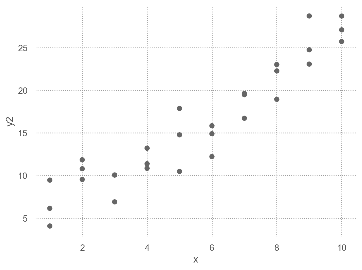
Data: sim3.csv
= pd.read_csv("data/sim3.csv" )
     x1 x2  rep     y  sd
0     1  a    1 -0.57   2
1     1  a    2  1.18   2
2     1  a    3  2.24   2
..   .. ..  ...   ...  ..
117  10  d    1  6.56   2
118  10  d    2  5.06   2
119  10  d    3  5.14   2

[120 rows x 5 columns]
Code
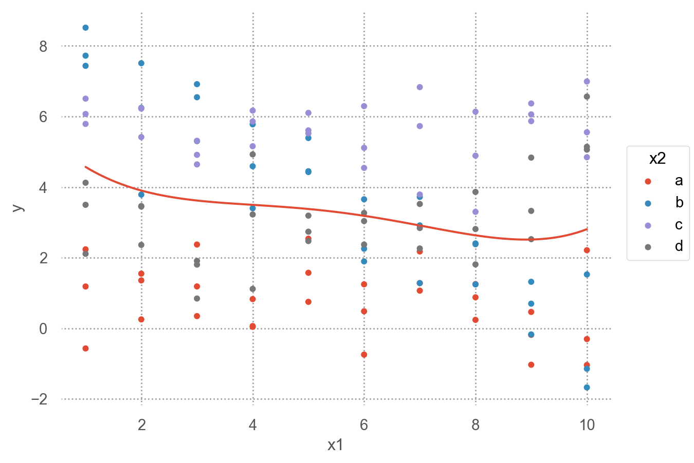
= 'x1' , y= 'y' , color= 'x2' )= 4 ))5 ), color= None )
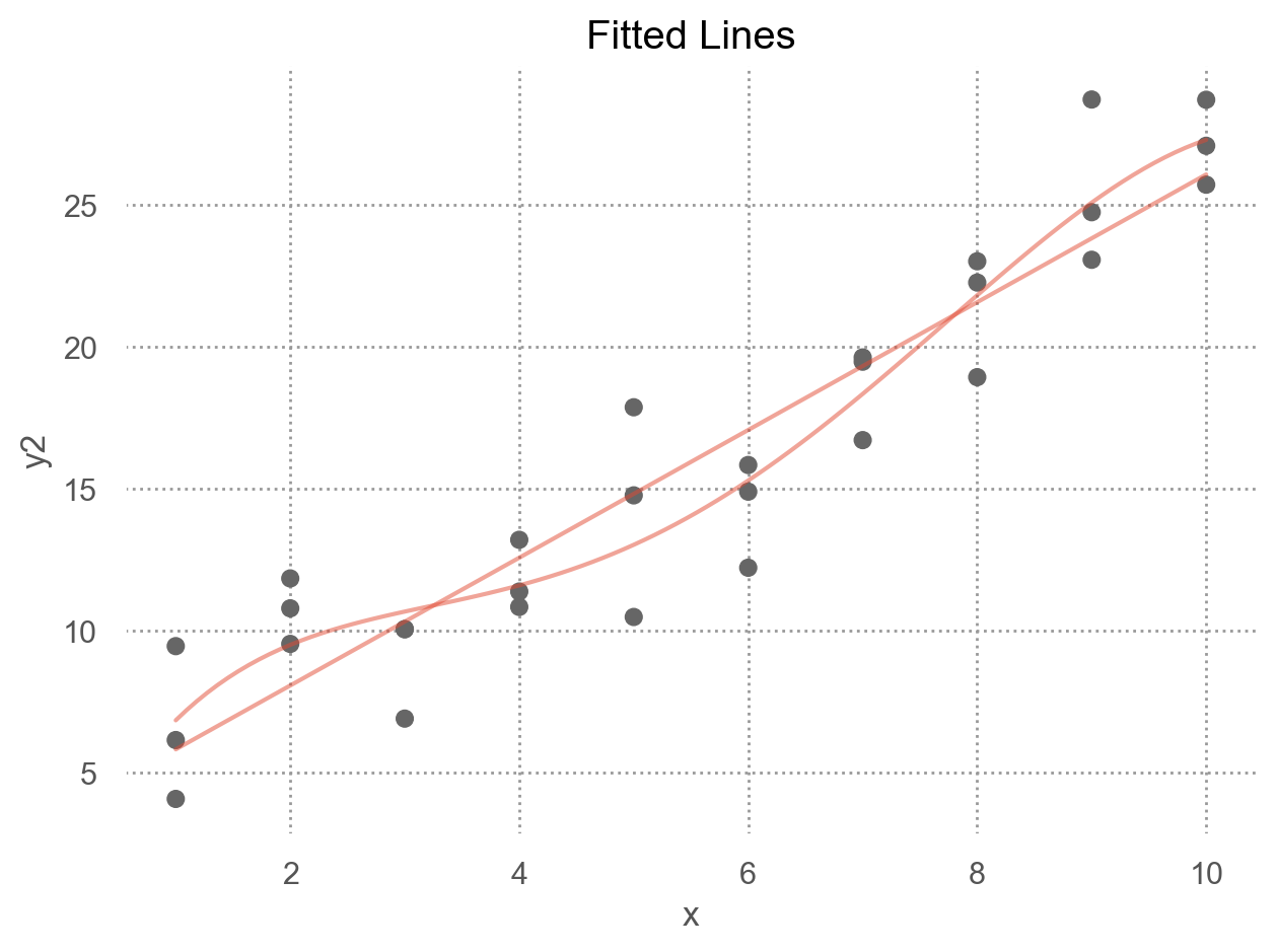
두 가지 모델로 fit할 수 있음
= ols('y ~ x1 + x2' , data= sim3).fit()= ols('y ~ x1 * x2' , data= sim3).fit() # 같은 의미 'y ~ x1 + x2 + x1:x2'
formula y ~ x1 * x2는 \(\hat{y} = a_0 + a_1x_1 + a_2x_2 + a_3x_1x_2\) 로 변환됨
하지만, 여기서는 x2가 범주형 변수라 dummy-coding후 적용됨.
= dmatrices("y ~ x1 + x2" , data= sim3, return_type= "dataframe" )1 :]
     x2[T.b]  x2[T.c]  x2[T.d]    x1
0       0.00     0.00     0.00  1.00
1       0.00     0.00     0.00  1.00
2       0.00     0.00     0.00  1.00
..       ...      ...      ...   ...
117     0.00     0.00     1.00 10.00
118     0.00     0.00     1.00 10.00
119     0.00     0.00     1.00 10.00

[120 rows x 4 columns]
= dmatrices("y ~ x1 * x2" , data= sim3, return_type= "dataframe" )1 :]
     x2[T.b]  x2[T.c]  x2[T.d]    x1  x1:x2[T.b]  x1:x2[T.c]  x1:x2[T.d]
0       0.00     0.00     0.00  1.00        0.00        0.00        0.00
1       0.00     0.00     0.00  1.00        0.00        0.00        0.00
2       0.00     0.00     0.00  1.00        0.00        0.00        0.00
..       ...      ...      ...   ...         ...         ...         ...
117     0.00     0.00     1.00 10.00        0.00        0.00       10.00
118     0.00     0.00     1.00 10.00        0.00        0.00       10.00
119     0.00     0.00     1.00 10.00        0.00        0.00       10.00

[120 rows x 7 columns]
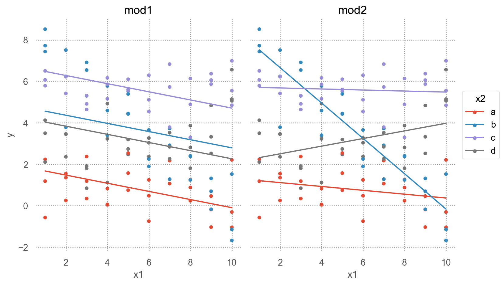
= sim3.value_counts(["x1" , "x2" ]).reset_index().drop(columns= "count" )"mod1" ] = mod1.predict(grid)"mod2" ] = mod2.predict(grid)= grid.melt(id_vars= ["x1" , "x2" ], var_name= "model" , value_name= "pred" )= grid_long.merge(sim3[["x1" , "x2" , "y" ]])
     x1 x2 model  pred     y
0     1  a  mod1  1.67 -0.57
1     1  a  mod1  1.67  1.18
2     1  a  mod1  1.67  2.24
..   .. ..   ...   ...   ...
237  10  d  mod2  3.98  6.56
238  10  d  mod2  3.98  5.06
239  10  d  mod2  3.98  5.14

[240 rows x 5 columns]
Code
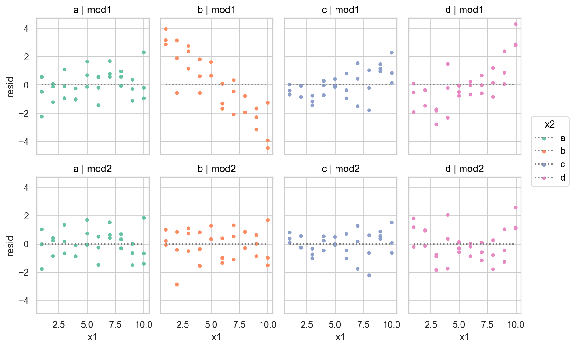
= "x1" , y= "y" , color= "x2" )= 4 ))= "pred" )"model" )= (8 , 5 ))
interaction이 없는 모형 mod1의 경우, 네 범주에 대해 기울기가 동일하고 절편의 차이만 존재
interaction이 있는 모형 mod2의 경우, 네 범주에 대해 기울기가 다르고 절편도 다름
\(y = a_0 + a_1x_1 + a_2x_2 + a_3x_1x_2\) 에서 \(x_1x_2\) 항이 기울기를 변할 수 있도록 해줌 \(y = a_0 + a_2x_2 + (a_1 + a_3x_2)x_1\) 으로 변형하면, \(x_1\) 의 기울기는 \(a_1 + a_3 x_2\)
= ols('y ~ x1 + x2' , data= sim3).fit()# Intercept 1.87 # x2[T.b] 2.89 # x2[T.c] 4.81 # x2[T.d] 2.36 # x1 -0.20 = ols('y ~ x1 * x2' , data= sim3).fit() # 같은 의미 'y ~ x1 + x2 + x1:x2' # Intercept 1.30 # x2[T.b] 7.07 # x2[T.c] 4.43 # x2[T.d] 0.83 # x1 -0.09 # x1:x2[T.b] -0.76 # x1:x2[T.c] 0.07 # x1:x2[T.d] 0.28
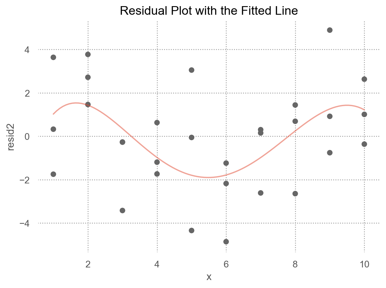
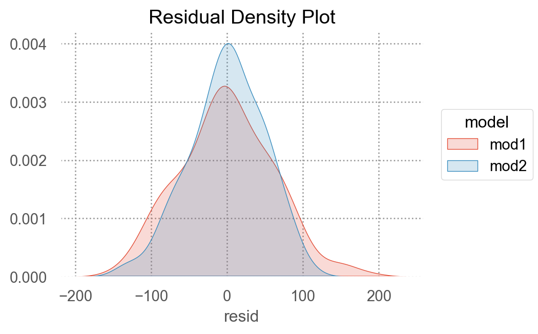
두 모형을 비교하여 중 더 나은 모형을 선택하기 위해, residuals을 차이를 살펴보면,
"mod1" ] = mod1.resid"mod2" ] = mod2.resid= sim3.melt(= ["x1" , "x2" ],= ["mod1" , "mod2" ],= "model" ,= "resid" ,
     x1 x2 model  resid
0     1  a  mod1  -2.25
1     1  a  mod1  -0.49
2     1  a  mod1   0.56
3     1  b  mod1   2.87
..   .. ..   ...    ...
236  10  c  mod2  -0.64
237  10  d  mod2   2.59
238  10  d  mod2   1.08
239  10  d  mod2   1.16

[240 rows x 4 columns]
Code
= "x1" , y= "resid" , color= "x2" )= 4 ))= ":" , color= ".5" ), so.Agg(lambda x: 0 ))"x2" , "model" )= (9 , 6 ))= "Set2" )
둘 중 어떤 모델이 더 나은지에 대한 정확한 통계적 비교가 가능하나 (잔차의 제곱의 평균인 RMSE나 잔차의 절대값의 평균인 MAE 등)
여기서는 직관적으로 어느 모델이 데이터의 패턴을 더 잘 잡아냈는지를 평가하는 것으로 충분
잔차를 직접 들여다봄으로써, 어느 부분에서 어떻게 예측이 잘 되었는지, 잘 안 되었는지를 면밀히 검사할 수 있음
interaction 항이 있는 모형이 더 나은 모형
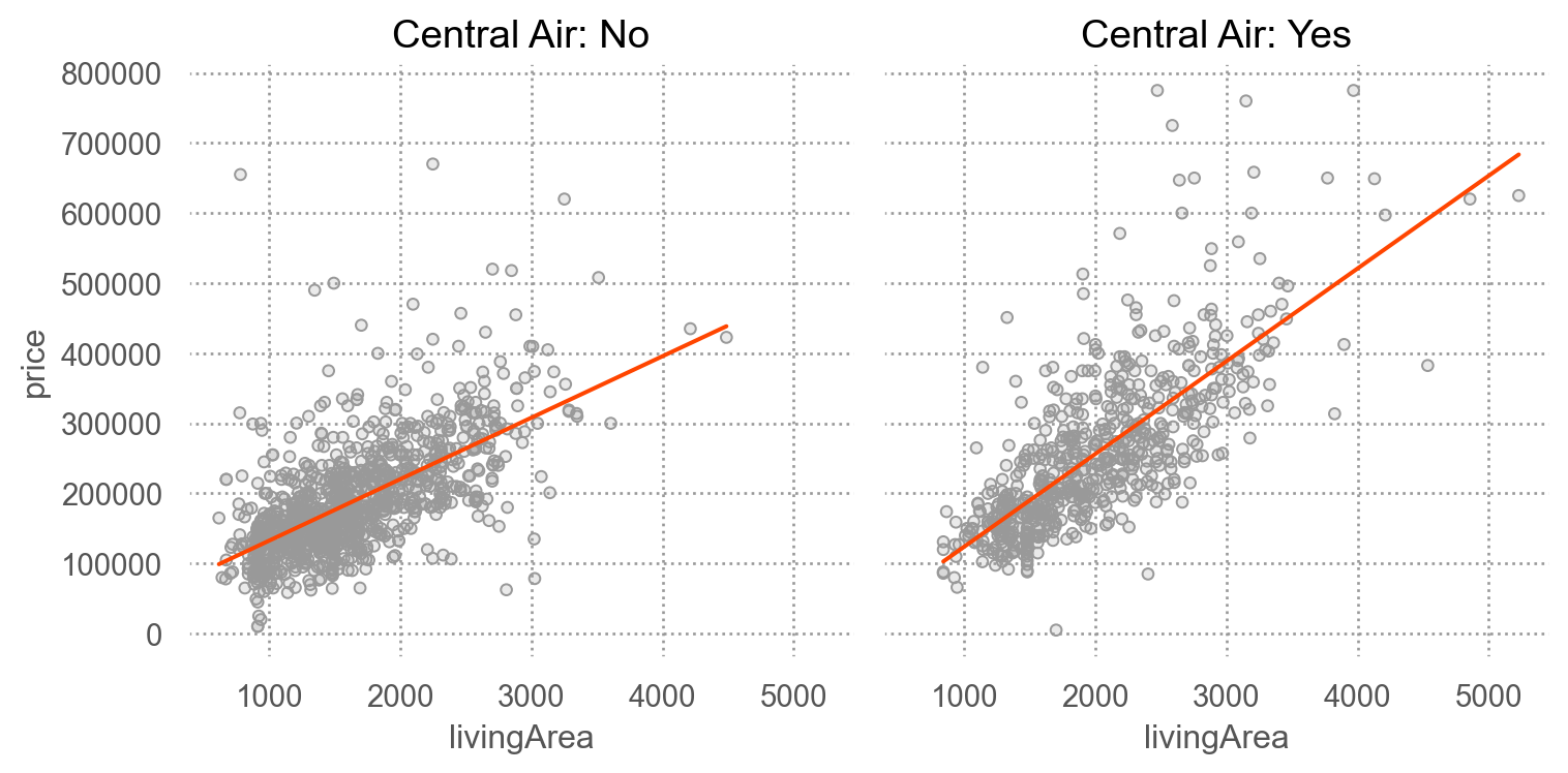
SaratogaHouses 데이터에서 가령, livingArea와 centralAir의 interaction을 살펴보면,
= sm.datasets.get_rdataset("SaratogaHouses" , "mosaicData" ).data= 'livingArea' , y= 'price' )= '.6' ))= "orangered" ), so.PolyFit(1 ))"centralAir" )= "Central Air: {} " .format )= (8 , 4 ))
= ols('price ~ livingArea + centralAir' , data= houses).fit()= ols('price ~ livingArea * centralAir' , data= houses).fit()
Intercept           14144.05
centralAir[T.Yes]   28450.58
livingArea            106.76
dtype: float64
Intercept                       44977.64
centralAir[T.Yes]              -53225.75
livingArea                         87.72
livingArea:centralAir[T.Yes]       44.61
dtype: float64
R-squared 비교